Friday, May 10, 2013

Practical concept vending table.
The cans of soda would be lined up on overlapping rows of conveyor belts.
The flavors would be separated into their own row.  The concept above has five rows of soda giving it a capacity for 120 cans of soda.  Each row holds 24 cans of soda and keeps them refrigerated.  When a selection is made on the touch screen the conveyor belt moves one can to a tray at the end of the bottom row.  The tray then lifts up with the can on it to the top of the table.  The table top retracts a cover to let the soda through. a pressure plate on the tray will keep the soda in place until the soda is removed.  If the selection is out of product, the touch-screen will notify the user with an invalid selection message.  Comes with optional wifi capabilities to notify companies when the vending machine is low on product.
The Vending table is designed for home or typical vending usage.  Companies can rent out the table like any other vending machine.  The perks for a company to use the table design are simple: inborn anti-theft, higher capacity, and better product placement.  The table top can be made of basic plastic, wood, or metal depending on consumer desires, or set as a sturdy lcd screen for advertisement use.  Since the trays use pressure plates set for one can at a time, no one can trick the machine into  free multiple sodas. Finally Higher capacity and low product notifications cut down on product refill deliveries.  This cuts down the cost of sending a truck to restock product.
business card
letterhead


Friday, May 3, 2013

The company that I would start will be about a club I help manage called the Shin-Sen_Gumi.  Basically the club is open to any who would be interested in joining.  There are thirteen captains, (leaders) for the Shin-Sen-Gumi, each with a different focus of hobbies.  The general similarities between the courts, (captain's sections), is that we all like anime.  My particular court is costume designing, medieval lifestyles, larping, and cosplaying.  Whenever someone in the club need a new costume design, they come to me or someone in my court.  I want my logo to incorporate at least one symbol used for costume or armor creation, something anime affiliated, and something medieval. 

Friday, April 12, 2013

This is the current logo for Elder scrolls in honor of the new elder scrolls online game.
I want to change this logo to incorporate all of the elder scrolls series to date. 
Im thinking of adding a dragon to the background with the previous games stamped into the wings with the current logo hanging around the dragon's neck.

Friday, April 5, 2013

Classwork today brought me into Illustrator for the first time. the project today was to use a scanned image of my face and make a trace of my face using shapes that I found on my face.  After about four scanners later, I was able to get a picture of my face that I could use.  this is the progress so far.

Friday, March 29, 2013

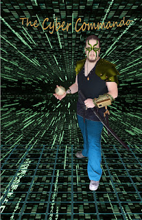
Here is the "final" product for my movie poster. I can't say that I like this piece and I will probably come back to this some time in the future to see if I can make this into something I like.  I feel that the poster itself is lacking something but so far can not decide what I really want to do with this.

Friday, March 15, 2013

This is my movie poster so far.  There will be a different outfit on me when the poster is finished. The work is based on a comic book character I started working on back in 8th grade called the Viral Commando.  I think I need to work on a better name for the movie rendition.

Friday, March 8, 2013


Todays practice activity was to create tiles based on textures found throughout the internet. 

Friday, February 22, 2013

My non-functioning wind powered airship.  Sadly not as good as the finished work I lost when my laptop died.  The jyst of this work is that this airship will only stay airborne as long as there is a wind current to fill the sails.  the airship is constructed from an old galleon with newer wings added. 

Friday, February 8, 2013

Updates on the project so far.  messing with layering and transformations.  I have added a couple magic seals and started working on making glowing eyes.  I will try to work on this more this week and will post some sort of update later.

Working on my first few photoshop images.  As expected, there is alot of work to put into an image and Im not even halfway done.  so far I have added a dragon and myself to an image.  I will probably move the dragon around and change it's size many times before this is done.  I need to think of a cool backdrop to add what I have to as well as more detail. I'm thinking some sort of magic aura around myself and each hand. We will see how things turn out.

Thursday, February 7, 2013

Comments on How to Ruin a Great Design

  I did not find this very interesting, and as a result it took several reading sessions to finish.  The basic flow of this article is broken into two parts.  The first part is about about traffic signs in Great Britain, and how poorly designed they have become.  The second part is about the redesigned logos of global companies.
  In the first part, the writer, Alice Rawsthorn, complains about how some of the redesigned traffic signs are "a crime against design."  She complains that the signs are too intricate and displeasing to the eye.  Alice's largest problem seems to be about a bicycle divergent sign the uses the font of the old signs but with different sized letters, an arrow, a bicycle, and a tacky yellow background.  I can agree that with traffic signs, simpler is better and the sign should probably be revised into something that doesn't take you mind off of driving.  Most traffic warning signs tend to have a yellow background, but nowadays that background has been upgraded with a highly reflective yellow surface that is very easy to see no matter what time of day.  The sign that Alice discusses in her article appears to be very dull, which would most likely hinder someone trying to drive and read it at the same time.
  The second part of the article discusses how companies have made very bad choices in upgrading their public appearance with bad logos.  Its only natural for companies to try to reinvent their image from time to time, this helps keep a steady money flow.  The problem tends to be, when updating logos, companies either try to hard or pale to the successful predecessor.  Alice's most common comparison with this logo problem is the update of the UPS logo.  I personally do not really remember the old look for UPS, or when it was changed, Alice fails to mention a date for the change.  Her problem with the new logo is that, as she puts it, the new logo looks like a "golden comb over" compared to it's predecessor.

Friday, February 1, 2013

My first photoshop work.  Not much, but everyone has to start somewhere.

Friday, January 25, 2013

What is my computer experience?
I have tons of experience as far as playing video games go.  I am decent at typing and I am learning how to write code.  I know far more on the PC than I do on a Mac.  the most work I have done on a Mac was back in third grade.  The screen had only two colors, green and black.  I have dismantled a number of PCs, as well as built a few from the remnants of broken towers. I am looking forward on learning more about the internal workings of computers though.
What is my major class?
My major is Video Game Design and Development.
What do I hope to get out of this class?
Well the first thing I would hope to learn out of this class better understanding and usage of a Mac.  The next things I would like to accomplish with this class is how to successfully use Photoshop and Illustrator.  I'm not sure yet how much I will be using this programs in the future but I can assume that I will be using in the future beyond my college career. 
Who is my favorite artist?
I can't say that I have a single favorite artist, as artists cover many different mediums.  My favorite painters are Salvador Dali, Van Gogh, and Jackson Pollock.  I have many music artists that I enjoy and choosing one or two to be a favorite is very tough.  a couple of my favorite bands include; Pink Floyd, Papa Roach, and Rob Zombie.  As far as movies are concerned, my favorite artist is George Romero. I am a big fan of zombie flicks and have enjoyed them since I was very little with my first zombie movie Dawn of the Dead.
Write a five line story.
Grotuct was a great goblin lord who was both respected and feared by his peers.  This fear was brought forth due to his tenacity, malicious intent, and the gleaming power of his sword and shield, which he kept on his person at all times.  There was no being that could defeat him in battle, but  Grotuct's downfall was that he was easily tricked.  A younger trickier golbin by the name of Fendrix,  tricked the goblin lord into believing that his shoe was untied.  With one swift slash of Fendrix's dagger, Grotuct's head went rolling down his precious shield, thus ending the tale of Grotuct.